Good Food - saving food waste!
Played a key role in redesigning the app for end users tackled navigation structure and Information architecture, of items, menu, and the app sitemap, and improved product listings and checkout process of ordering from different locations at the same time! during this overview, you will explore on the following page a way to solve those challenges. Senior product designer Competitor research and trends Business, engineers
Senior product designer
Competitor research and trends
SEO, Growth, Engineering
Intro
Background
Good Food company operating from Egypt takes care of the leftover food in whole or meals from restaurants, and supermarkets and offers it back to users at a discounted price instead of letting them go to waste, The app needed a redesign to be able to accommodate a good experience as well the purpose of it and I was hired to take upon the challenge.
Moodboards
Site map
In recognizing the need for enhanced navigation, our team unanimously decided to overhaul the app's sitemap. Our focus pivoted on optimizing the user journey in several key areas:
Streamlined product discovery.
Encouraging repeat purchases of previously bought items such as food from supermarkets.
Facilitating easier access to the cart.
Consolidating other menu items under a recognizable menu drawer that users would recall when they need it.
Prioritizing these elements in top-tier navigation touchpoints.

Moodboards
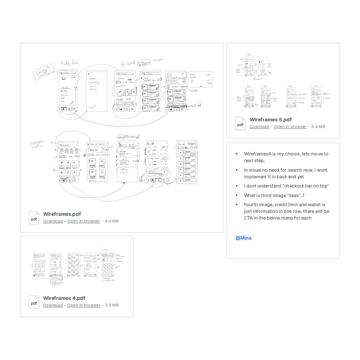
Wireframes
With the new sitemap as our foundation and a unified objective of enhancing discovery, collaborative workshops with stakeholders proved invaluable. Guided by this shared vision, I developed wireframes that delved into diverse layouts and concepts. Ultimately, we converged on a design that seamlessly realized our collective aspiration.
Moodboards
Wireframes
With the new sitemap as our foundation and a unified objective of enhancing discovery, collaborative workshops with stakeholders proved invaluable. Guided by this shared vision, I developed wireframes that delved into diverse layouts and concepts. Ultimately, we converged on a design that seamlessly realized our collective aspiration.
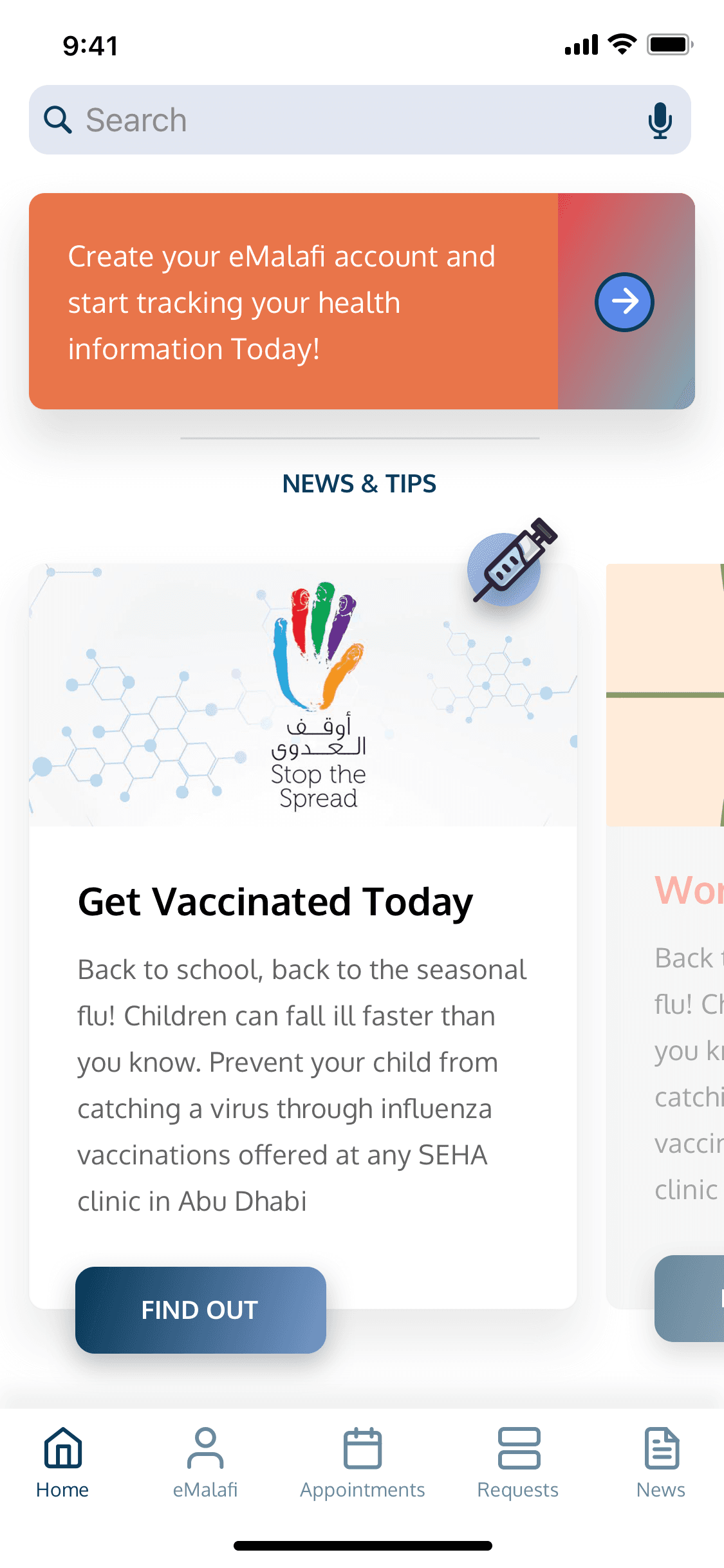
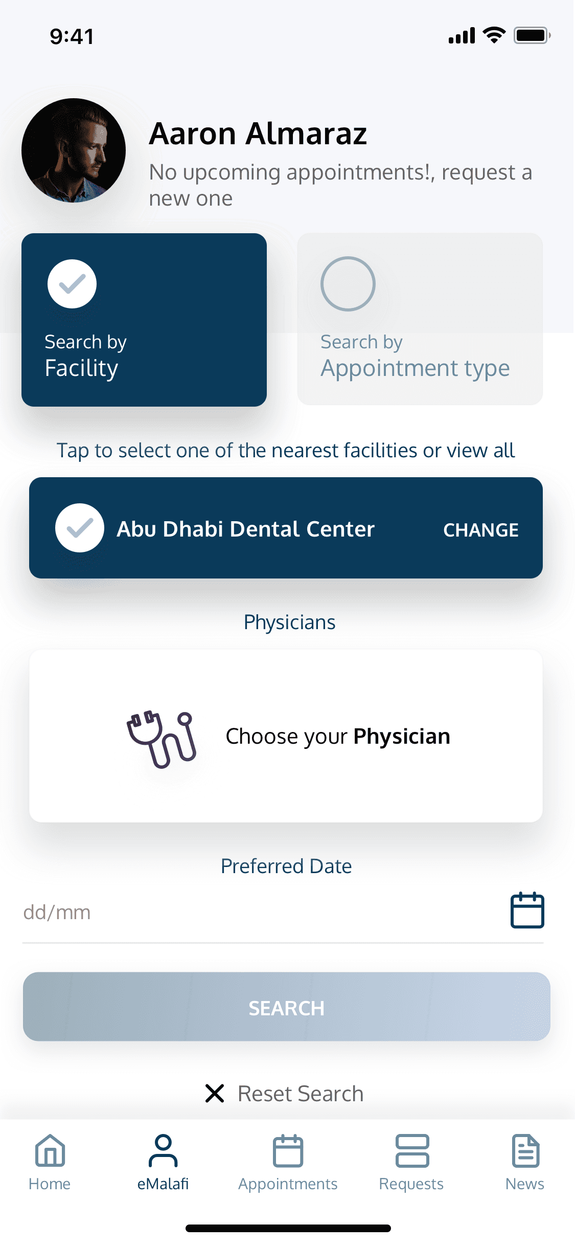
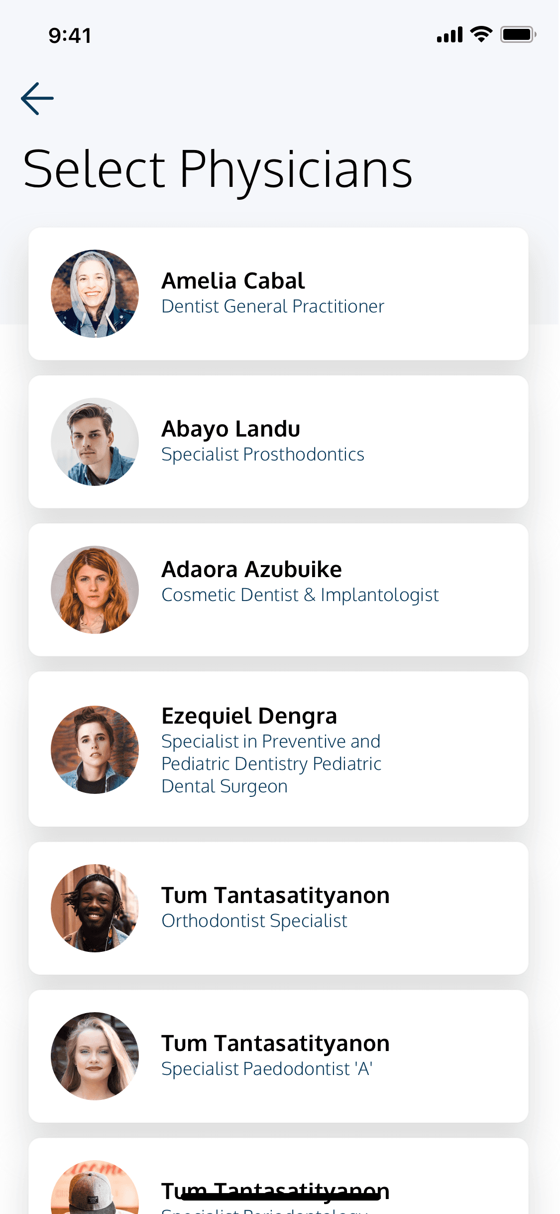
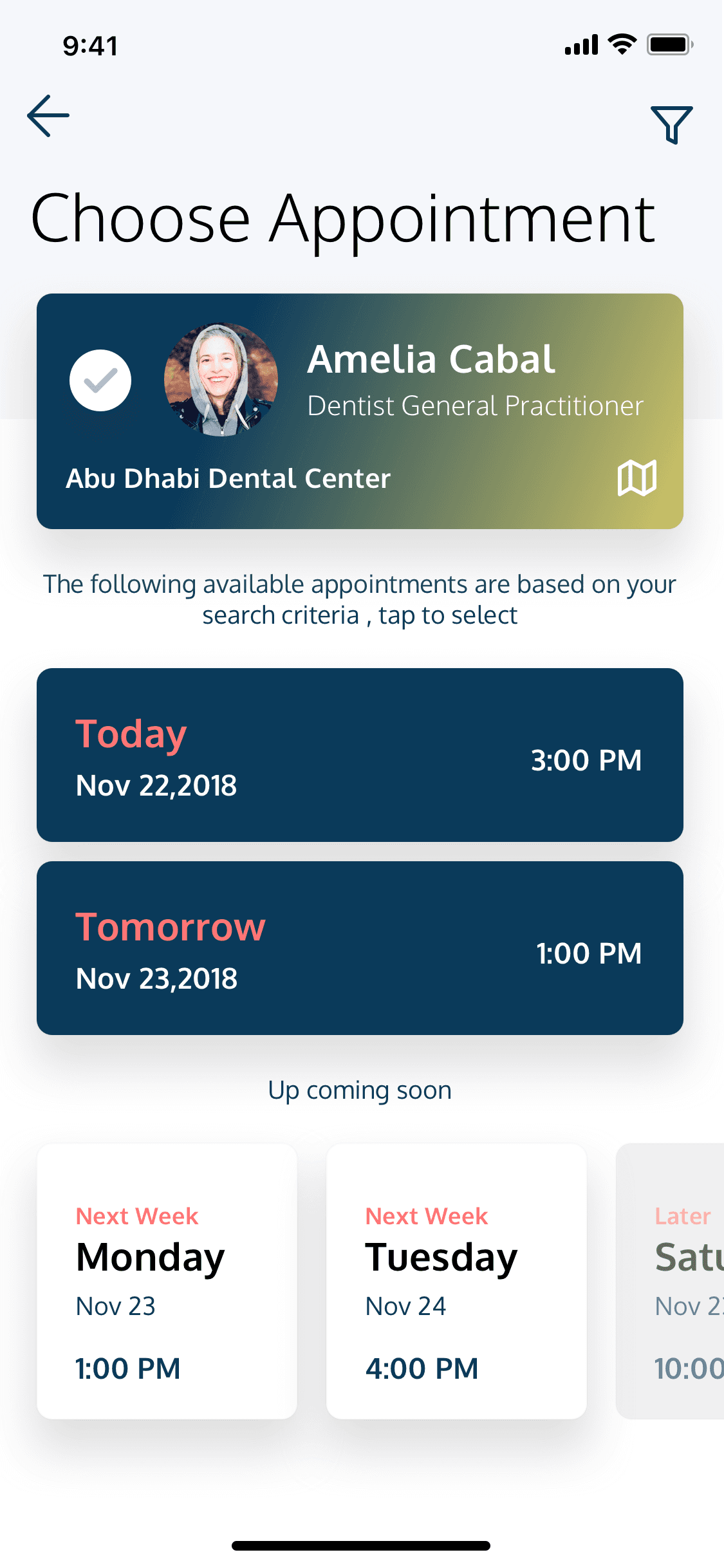
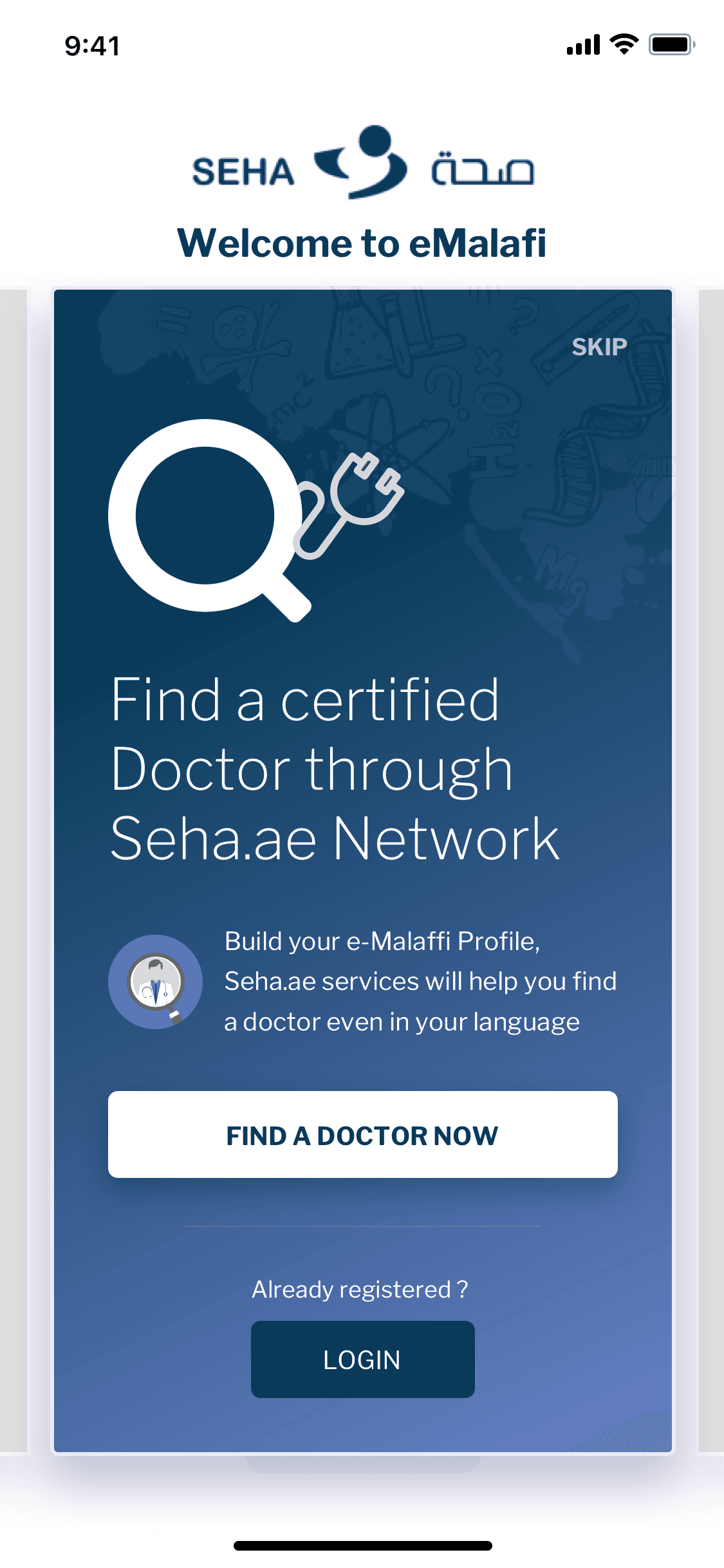
Proposed experience
An approach to emphasis on user-centered design to track health, medical profile and a fast way to book appointments was a very clear direction, we suggested two different UX/UI concepts with different navigational points.
Next Let’s have a look at some of the components followed by Complete UI
Next Let’s have a look at some of the components followed by Complete UI
Discovery
High Fidelity Designs
Discovery
High Fidelity Designs
Discovery
High Fidelity Designs
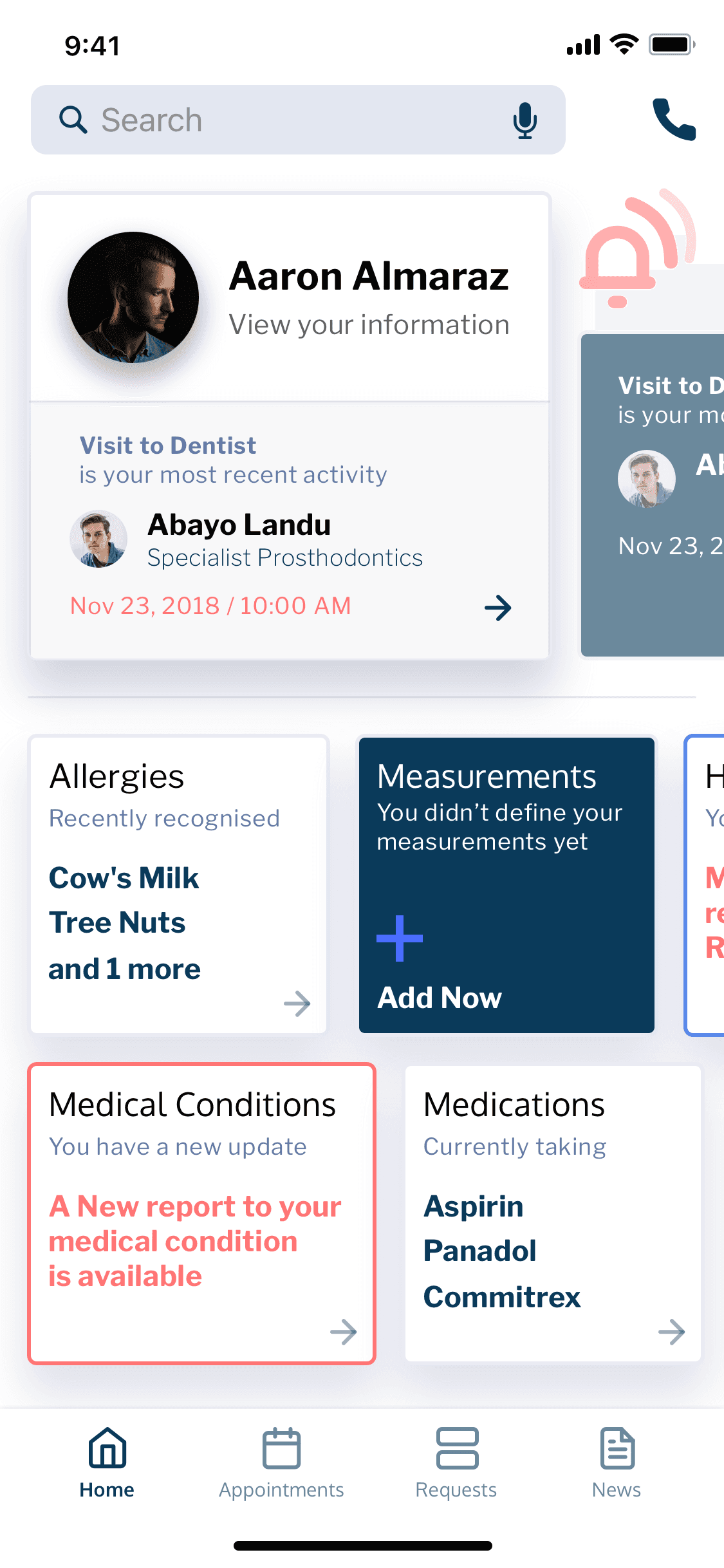
Hypothesis
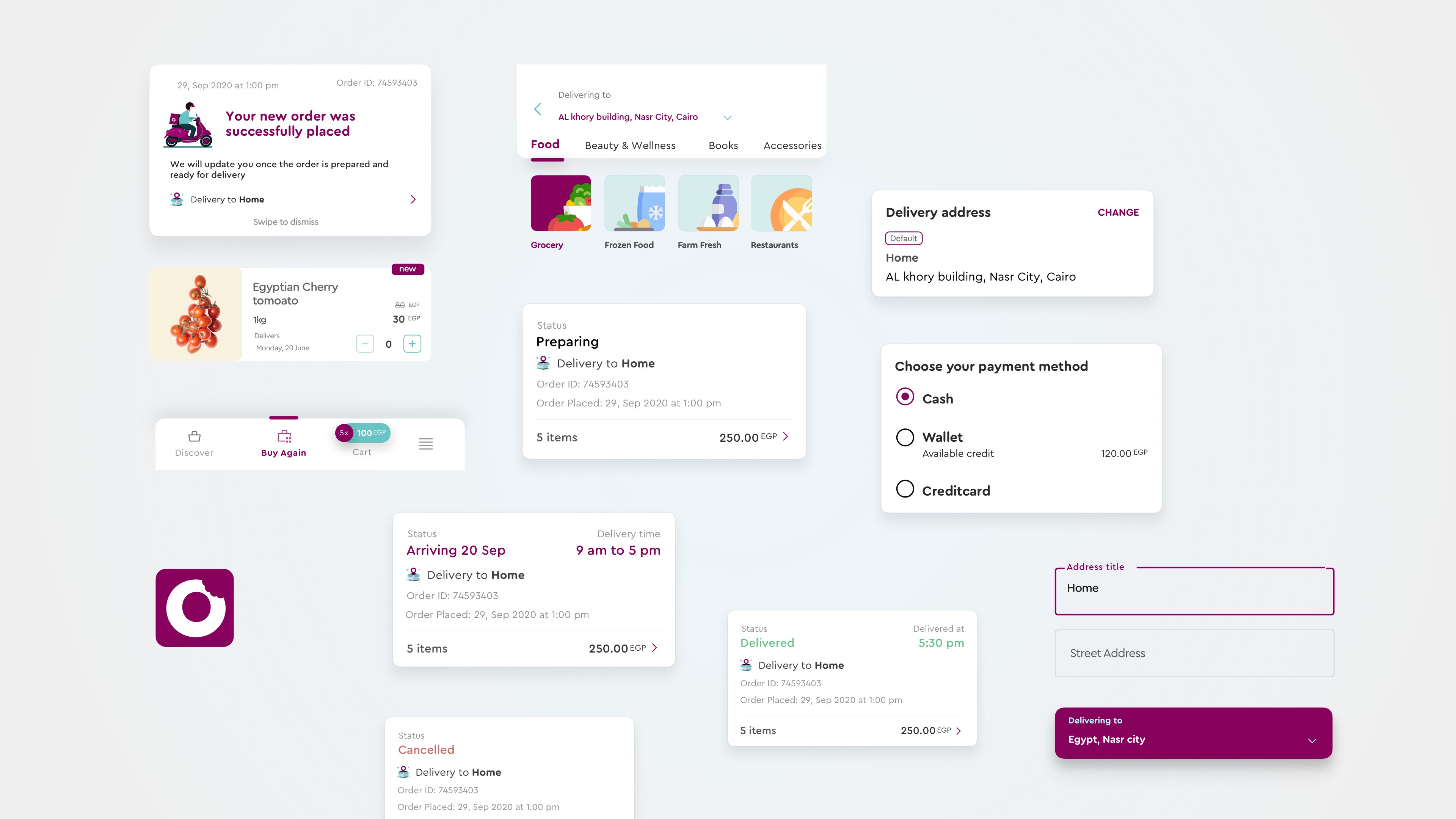
The Previous app navigation structure was under a menu sidebar however based on the common patterns we wanted to bring top-level menu items forward such as Discover, Buy Again, Cart with amount visible, and a menu drawer to access the remaining views.
The Previous app navigation structure was under a menu sidebar however based on the common patterns we wanted to bring top-level menu items forward such as Discover, Buy Again, Cart with amount visible, and a menu drawer to access the remaining views.
The Previous app navigation structure was under a menu sidebar however based on the common patterns we wanted to bring top-level menu items forward such as Discover, Buy Again, Cart with amount visible, and a menu drawer to access the remaining views.
Discovery
Discovery
Discovery
Hypothesis
The Previous app navigation structure was under a menu sidebar however based on the common patterns we wanted to bring top-level menu items forward such as Discover, Buy Again, Cart with amount visible, and a menu drawer to access the remaining views.
The Previous app navigation structure was under a menu sidebar however based on the common patterns we wanted to bring top-level menu items forward such as Discover, Buy Again, Cart with amount visible, and a menu drawer to access the remaining views.
The Previous app navigation structure was under a menu sidebar however based on the common patterns we wanted to bring top-level menu items forward such as Discover, Buy Again, Cart with amount visible, and a menu drawer to access the remaining views.
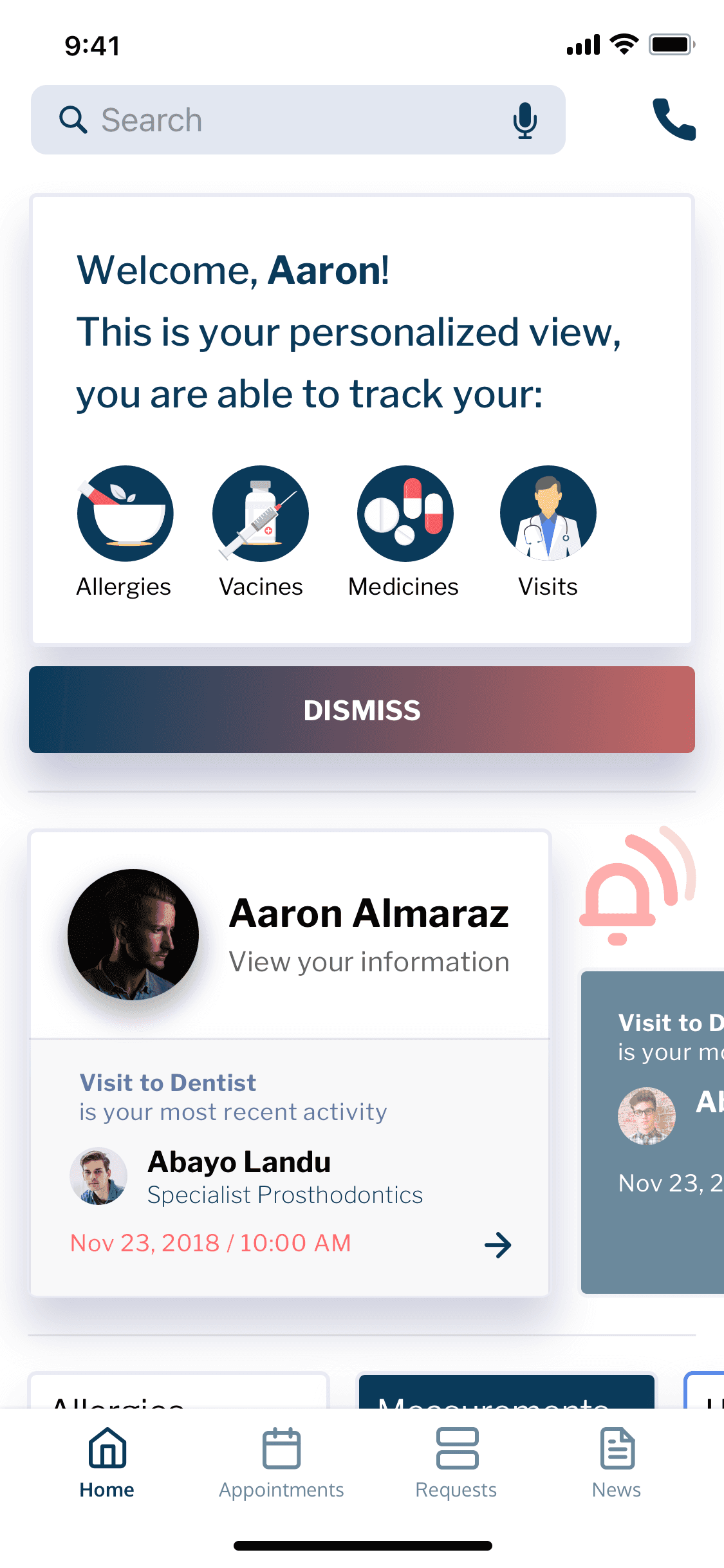
Hypothesis “Accessibility, Discovery"
In redesigning the products and categories interface, we posit that by enabling users to seamlessly navigate between main and subcategories from the home page, engagement will be enhanced. Our component behavior would introduce a tabbed design for all main categories, emphasizing key "GoodFood" selections, with identifiable presentation icons for subcategories. We anticipate that this familiar navigation pattern will simplify the user experience, quick scanning of subcategories will amplify cross-category purchases, and maintaining a singular view, as opposed to toggling between screens, will expedite and streamline user interactions.
In redesigning the products and categories interface, we posit that by enabling users to seamlessly navigate between main and subcategories from the home page, engagement will be enhanced. Our component behavior would introduce a tabbed design for all main categories, emphasizing key "GoodFood" selections, with identifiable presentation icons for subcategories. We anticipate that this familiar navigation pattern will simplify the user experience, quick scanning of subcategories will amplify cross-category purchases, and maintaining a singular view, as opposed to toggling between screens, will expedite and streamline user interactions.
In redesigning the products and categories interface, we posit that by enabling users to seamlessly navigate between main and subcategories from the home page, engagement will be enhanced. Our component behavior would introduce a tabbed design for all main categories, emphasizing key "GoodFood" selections, with identifiable presentation icons for subcategories. We anticipate that this familiar navigation pattern will simplify the user experience, quick scanning of subcategories will amplify cross-category purchases, and maintaining a singular view, as opposed to toggling between screens, will expedite and streamline user interactions.

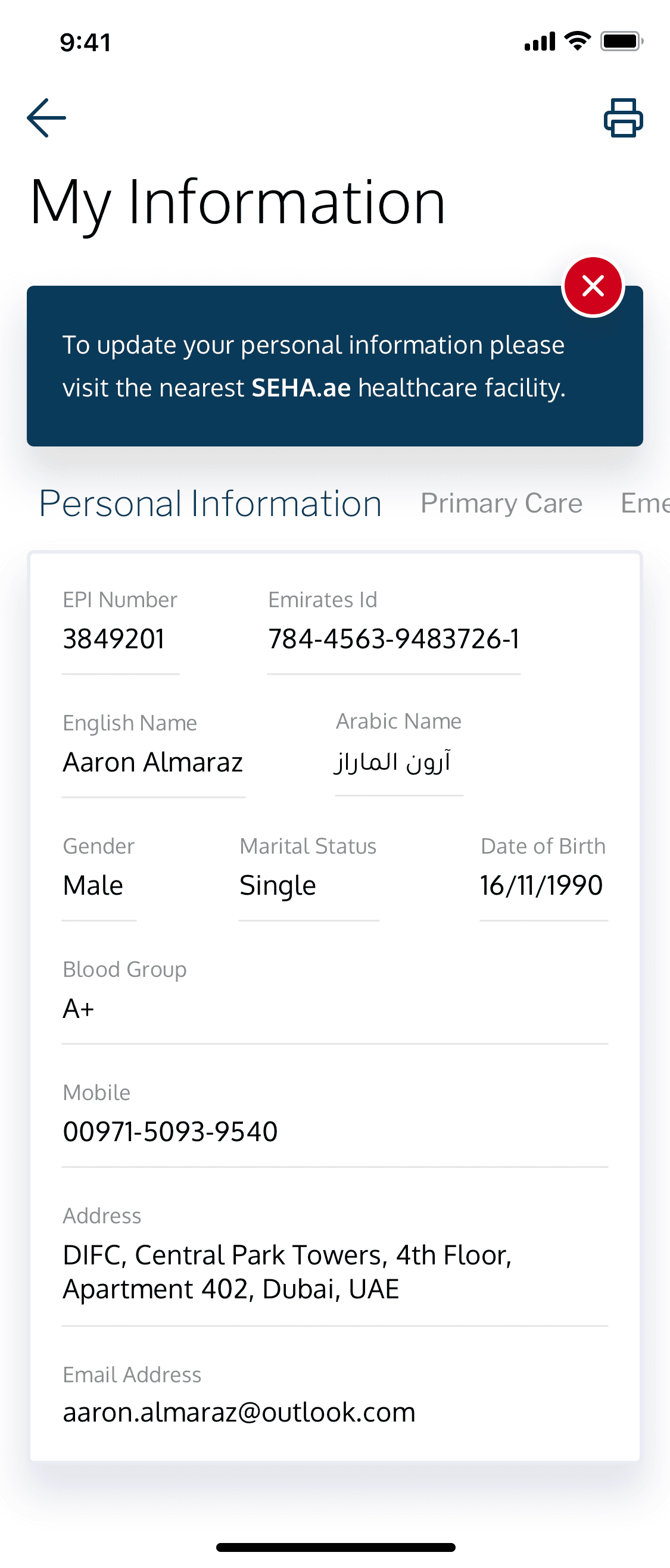


Another Approach